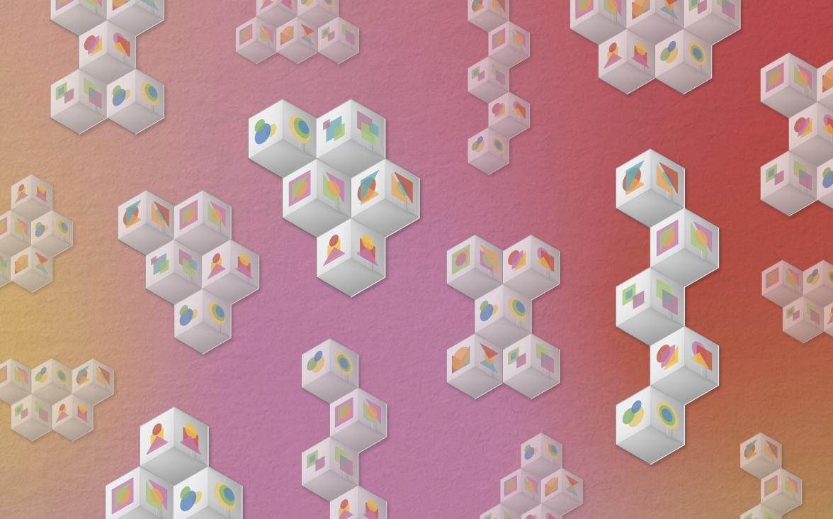
UI design by Caro Jaschek
About the slavery museum
Within the next few years, the Nationaal Slavernijmuseum, a new national museum of slavery, should open its doors to the public. Documenting the history of transatlantic slavery and slavery in the Dutch colonies in the Indian Ocean will be the museum’s guiding principle. The museum’s content will target a broad audience, with a focus on education, art, information and research. The Ministry of Education, Culture and Science supports the initiative.
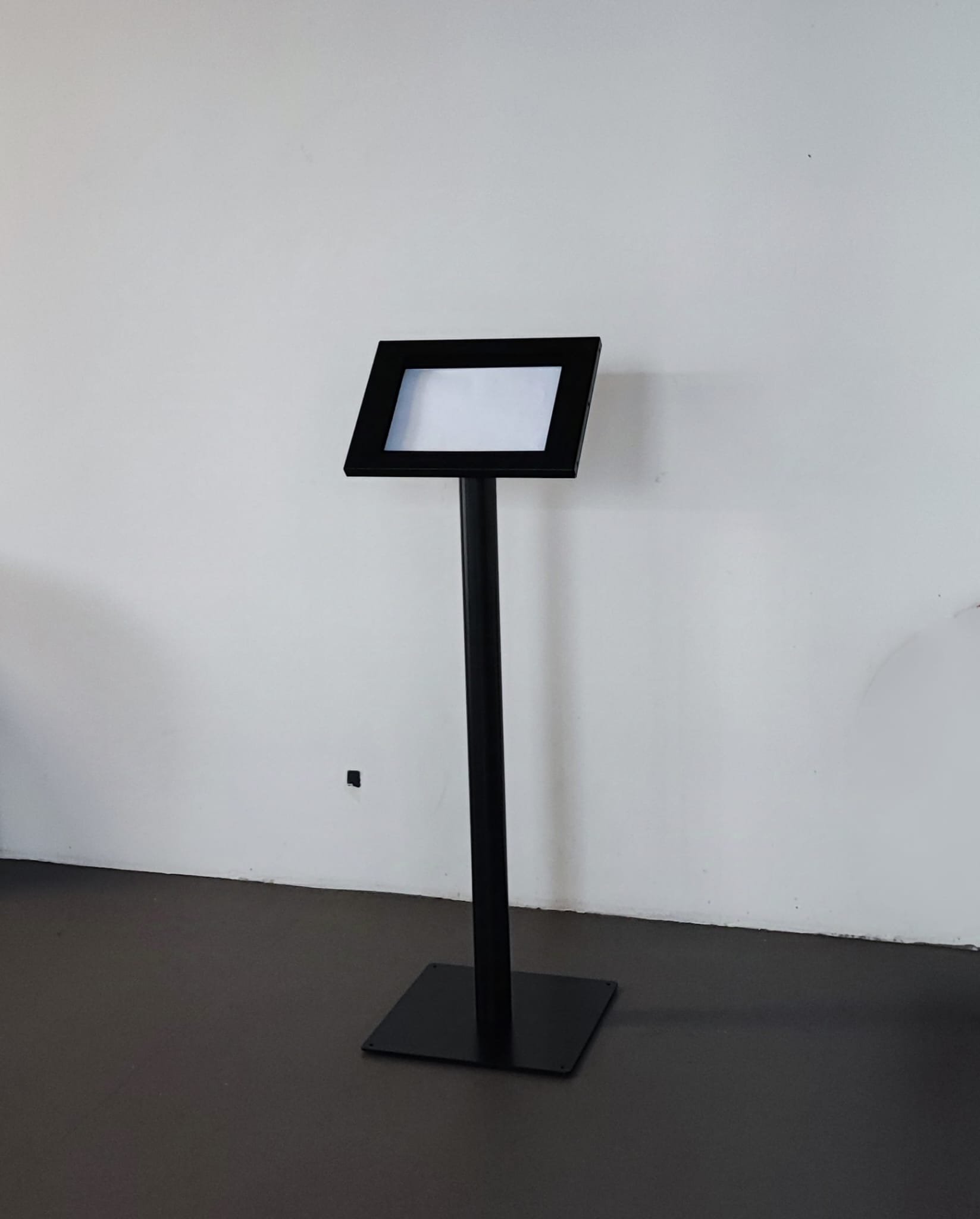
We at Shosho were asked to create an interactive exhibit (with touchscreen 24 or 27 inch, kind of a pedestal) that allows people to share their opinion on the future slavery museum while also fostering awareness, engagement and a feeling of co-creation.
Places to showcase: Resistance Museum Amsterdam, Nederlandse Bank, National archive
and Festivals


Kick-off: DeBrief / Framing
After a round of brainstorming we came up with a few “solid” and “liquid” values. meaning things that cannot and can be changed. Also we answered a big question: Why not an online survey?
Our solid values:
there will be a survey with less than 8 questions
feeling of co-creation
community involvement (share opinion, suggestions, personal stories
flexibility and mobility: travel to different locations, easy to set up
gives adequate information about the upcoming museum (it should be an information station)
get information in a playful and meaningful way to make the survey pleasant to answer to
Our liquid values:
each location has a special connection with this moving exhibition that is projected with a color theme, logo or a special characteristic.
Showcase an object from the museum (to contextualize better)
it’s a rewarding process.
Visitors can see other answers to compare their preferences.
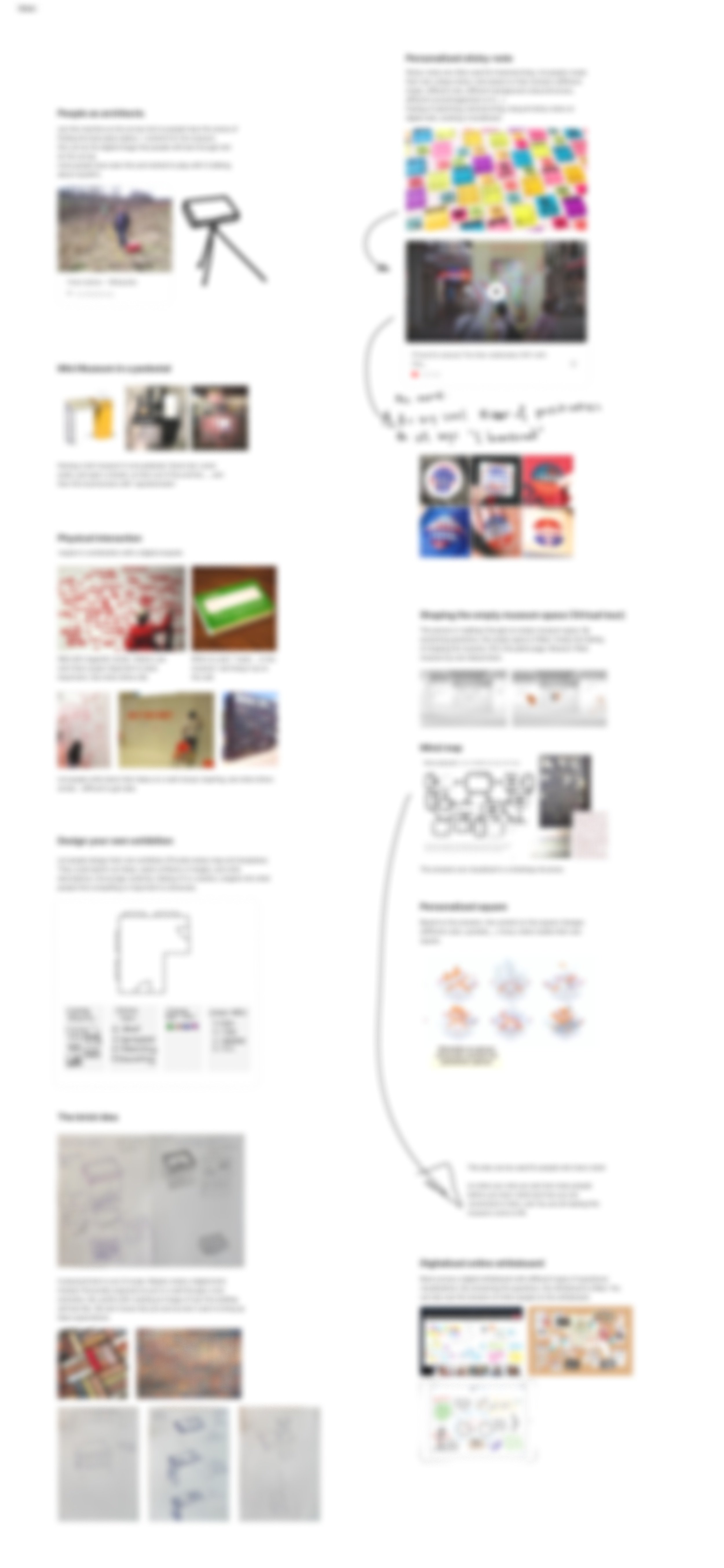
IDEAS
The brick idea
in this idea, visitors interact with the (digital) survey on a pedestal that looks like a pizza oven, with a slight difference: this is a brick oven. as you complete the survey you are informed that your name is being (UV) printed on a brick, which in future will be used in the construction of the museum. I thought of making an actual brick every hundred surveys completed with peoples name on it. to strengthen the sense of co-creation and encourage visitors to take part.
open Mic
our voice is personal and unique and it feels more empathetic and compationate to record an audio for someone, rather than texting them. that’s the thought behind this idea. instead of old-fashioned surveys, let’s have a survey station with an open mic where people can record their opinion and listen to other opinions about the questions.
people as architects
This idea takes you on a virtual tour around the empty space of the museum. you have to decide what to put and how to design each section of this museum. your answers decide the arrangement of the objects and the message you want this museum to amplify.
digital sticky notes
We use sticky notes to brainstorm and shape an idea, so why not provide visitors with a lot of them, digitally, so they can also start ideating about their preferred future museum?
this idea uses a familiar convention to instantly send visitors a message about how the museum values their opinion
Card sorting wall
this idea involves a diigital interactive wall or an actual wall size magnetic board with different ideas for different parts of the museum like: what should the museum be about? What type of objects should it showcase? which chunk of the history should it focus on? and …
visitors can simultaneously interact with this wall and sort their preferred ideas in under different categories. this idea encourages co-creation as well as inclusivity
MIni museum
this idea showcases a real or a dummy object from the museum in a small scale. this idea should trigger curiosity and also familiarize visitors with “what the museum wants to be about”
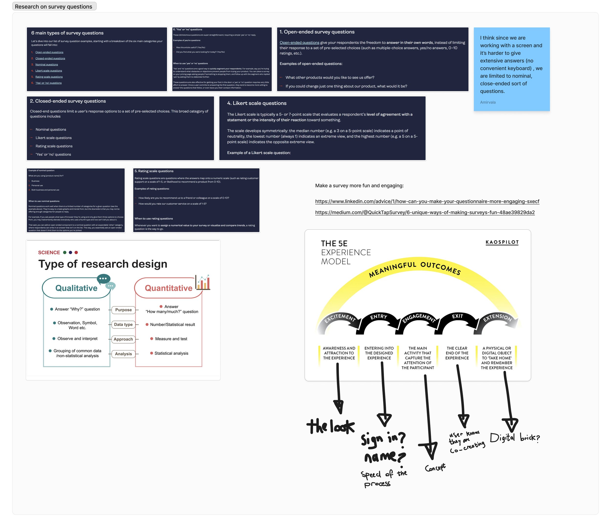
Research phase: what questions to ask?
We started a research phase for the questions to ask in order to customize the survey in the best way possible suited with our ideas.
the most important factors that we considered were: what decisions has not already been made and how much freedom we can give visitors to decide about the context of this museums? what exactly is the data we want and how much data do we need to be able to translate it into a decision for the museum?
that’s why we stated studying different types of surveys and questionnaires. Also we made a decision to put more weight into quality of the data rather than the quantity because this “exhibition” won’t be running for long.
here, we also started shaping the user flow and the interaction that the visitor would make with our design.
After a feedback session we could come up with a preliminary design for the exhibition, as well as a color pallet and visual design inspiration.
Feedback and preliminary designs

The client decided to give a go to the “mini museum” design, but with a few changes. most importantly, having a historic object displayed in a moving exhibition would require a lot of care and paperwork so we removed that from the design. We started iterating on that.

This visual inspiration board was decided base on our talks with client and finding out about the values they would want to emphasize on. Such as empathy, community, power and society. most importantly being inviting to people who want to shape the future of this museum.

The color pallet was pre-decided

client’s decision about the content
The client decided that they want the idea in which people can shape an empty space of the museum. so we came up with this final design in which, we present a cube to the visitor that represent an empty space in the museum, and visitors shape this space with every answer they give. the questions are multiple choice and each choice makes a different mark on the place

client’s decision about the design
The client decided that they want the design as budget friendly, easy to assemble and move as possible. So we decided to move on with a pedestal / digital signage idea. We are again ideation about how to make something that can travel easily and is sturdy enough to resist in festivals and open space.
Ideation and prototyping
Ideation and prototyping
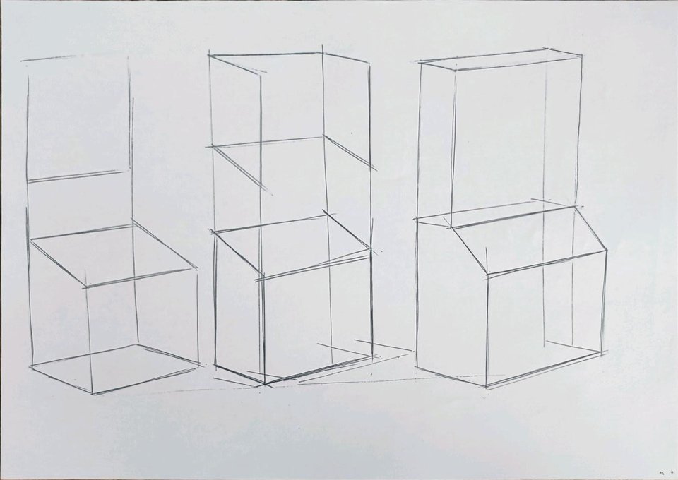
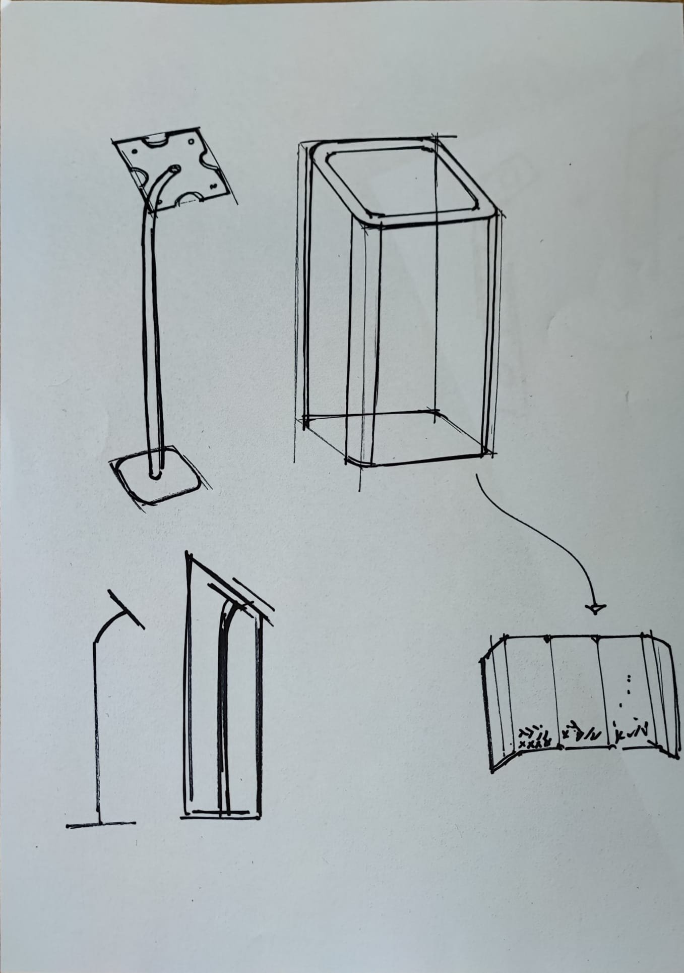
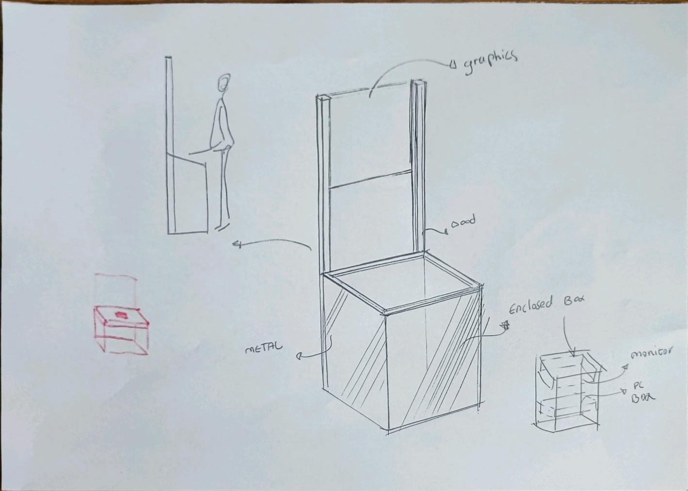


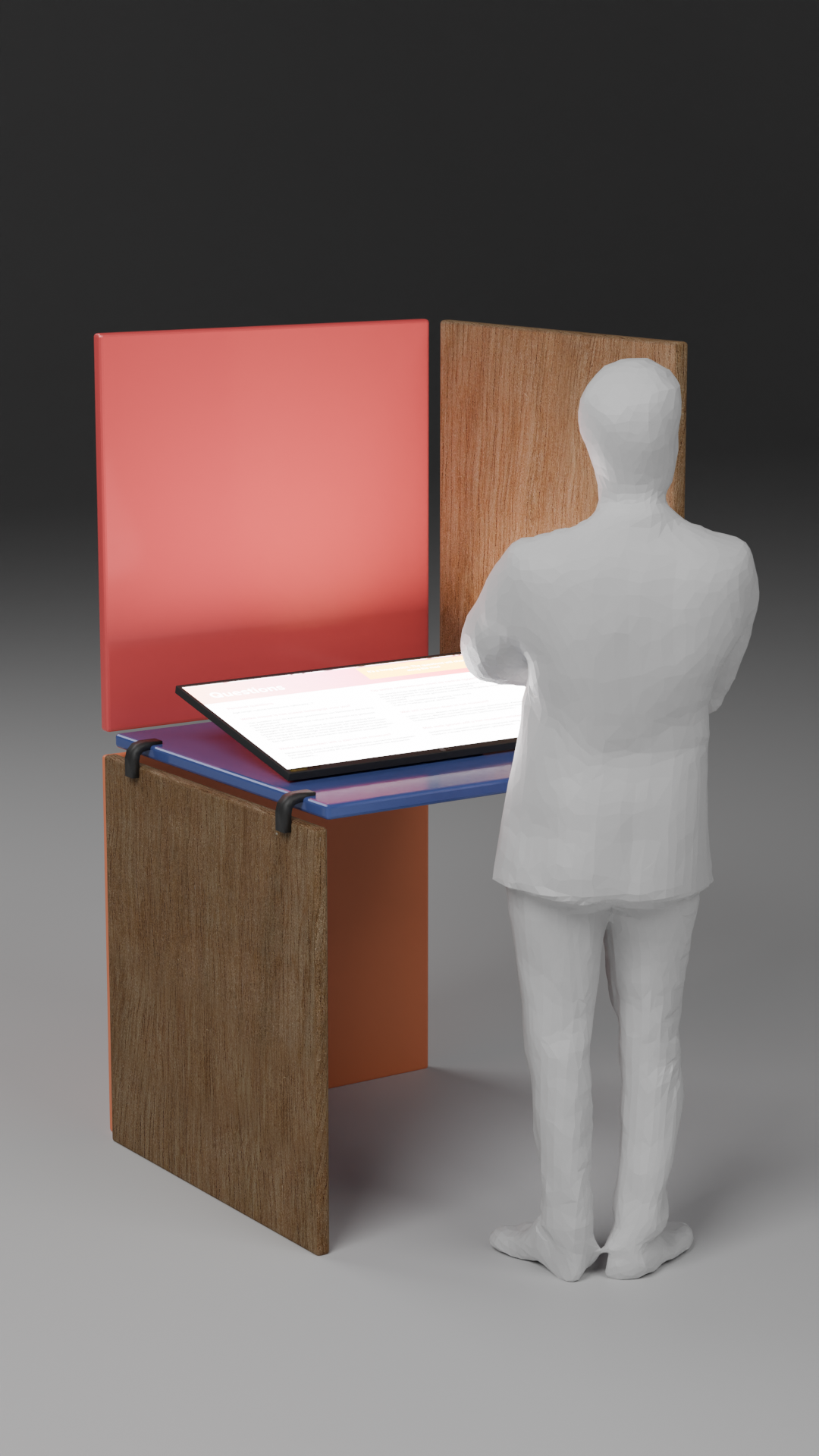


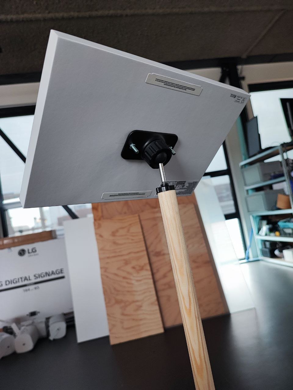


As shown in the pictures I made a rough prototype of a pedestal which can be folded into a case and carried around and travel like a suitcase. I used a shelf from an IKEA stationary storage and two mopping handles. I believe this is my strength to put together a quick and rough prototype to clarify for myself and the client what we mean by our design and how it will look like (kinda!).
Although it received a positive feedback and a pat on the back from the client, they decided to buy a ready-made pedestal to save some more budget and also speed-up the process.
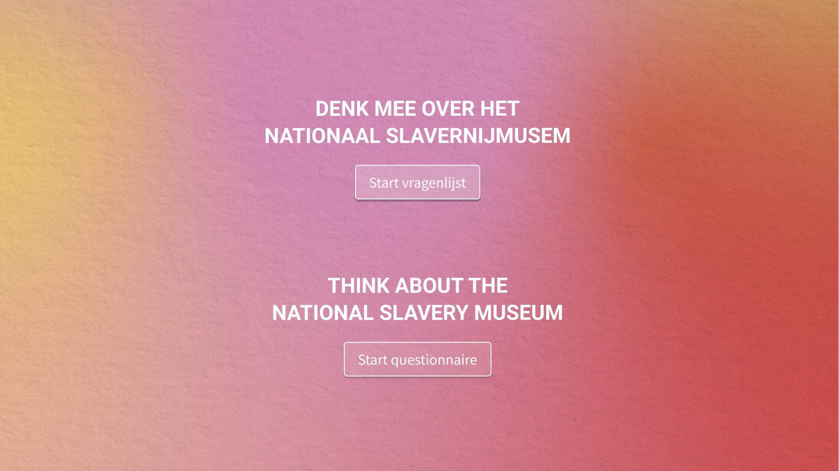
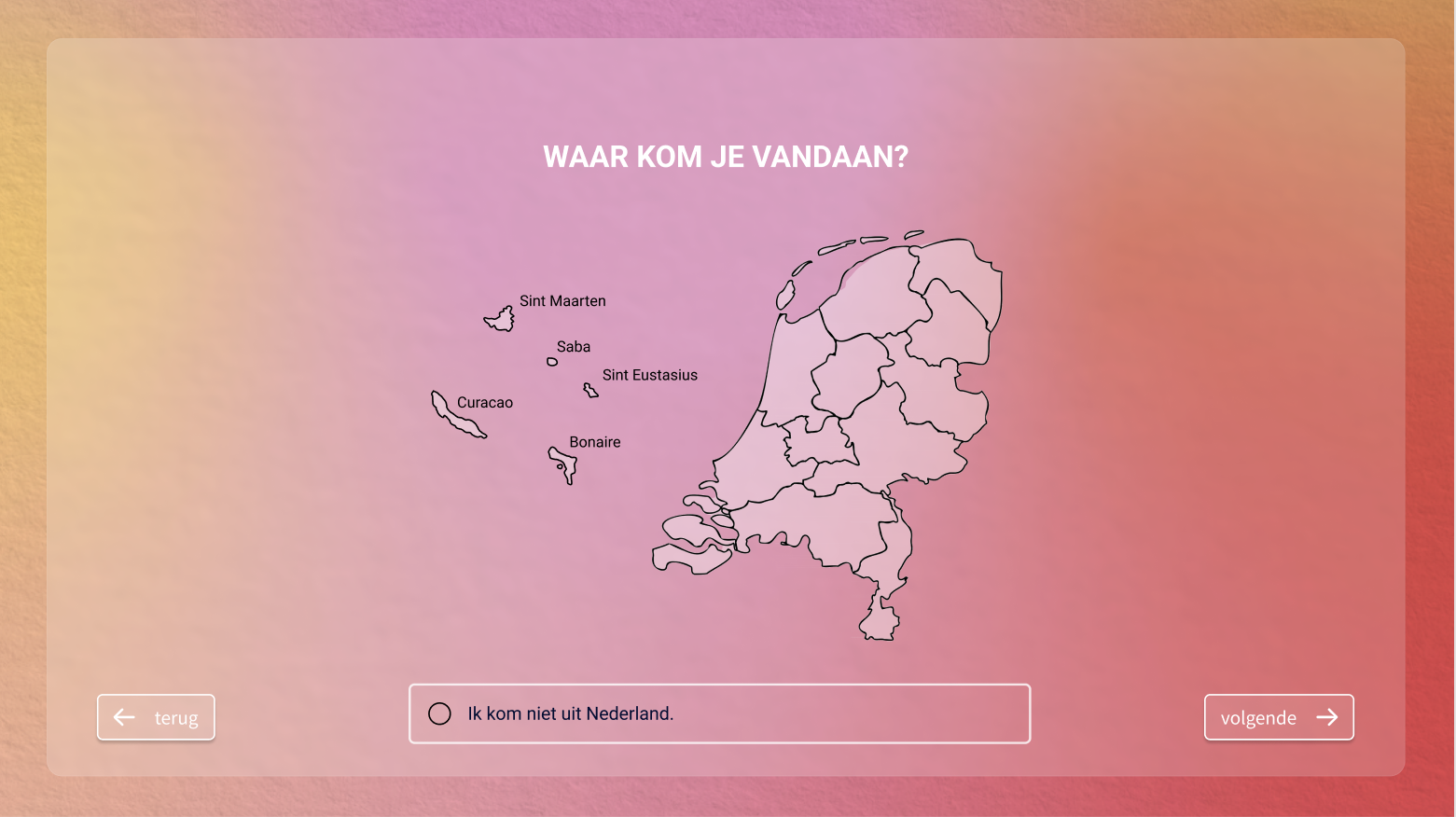
below I share the user interface design that we came up with for this traveling exhibition.
